The Poll
The boring choice wins. Your students will not believe it until the scoreboard proves it.
See what your students get, and why it lands.
No mockups. Every page below is real, pulled straight from the files you download. Tap any one to see it full size.
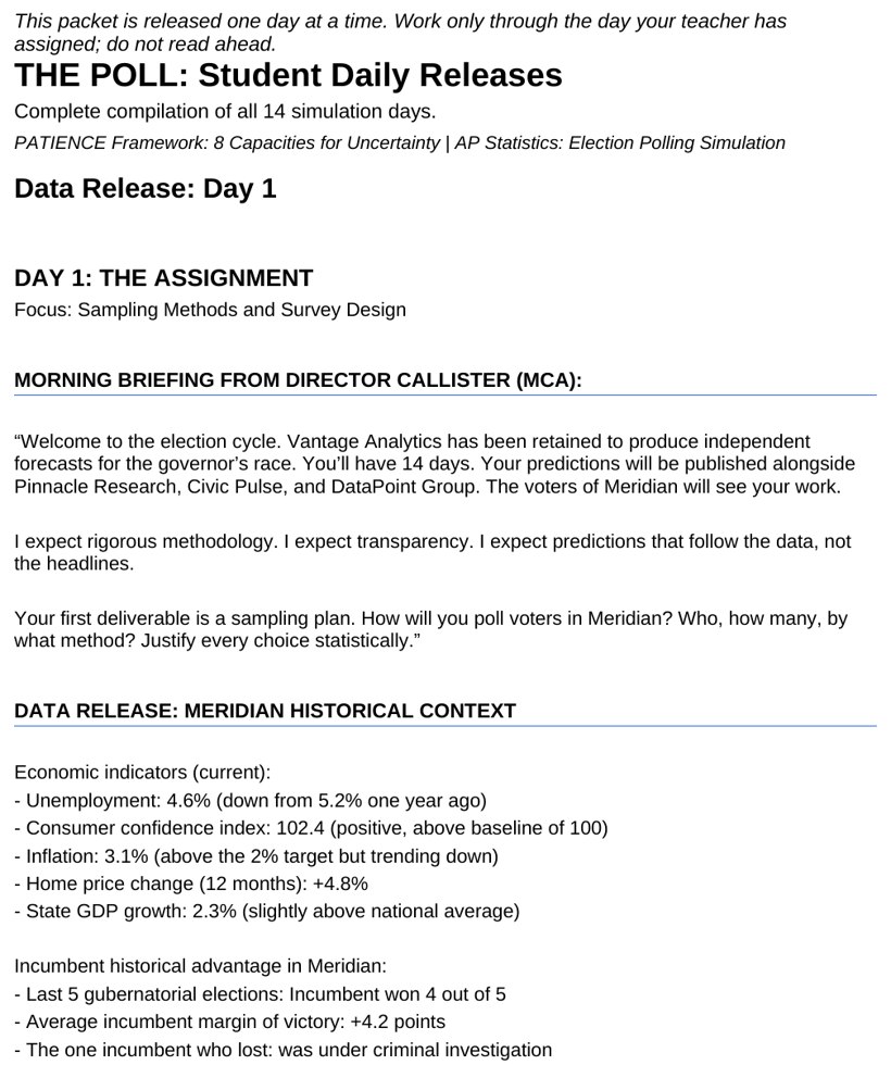
Your students are not answering questions. They are making a call.
Each case day opens with a fresh data release. A tracking poll lands showing a four-point swing in the governor's race, and your students have to decide what it means before the next briefing. Is it a real shift or sampling noise? The p-value sits at 0.169, so the honest read is that nothing significant has happened, but the headline screams momentum. Students working as junior analysts at Vantage Analytics weigh the n=200 sample against the historical baseline, the rival firms' published numbers, and a client who wants a confident forecast. They commit a prediction in writing, with the reasoning that backs it. No worksheet asks for that. A worksheet was never going to teach a student to hold the line when the data is quiet and the room is loud.
Tap to read a daily polling release
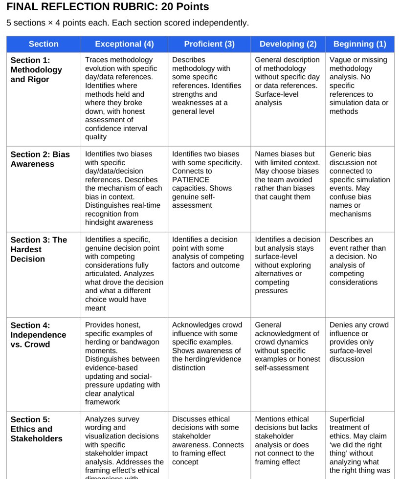
They are graded on the reasoning, not the result.
Statistics is the study of uncertainty, so a methodologically perfect model can still miss the final margin. The 36-point Dual Assessment Rubric grades for that reality. Sixteen points come from the Daily Journal, where students document each decision with specific data references and name the bias they were fighting. Twenty points come from a five-section Final Reflection that audits where their method held, where they herded, and how their framing choices affected stakeholders. A student who anchors to base rates and updates modestly scores well even when the election surprises everyone. A lucky guess backed by no analysis does not. The rubric makes the standard explicit: show the thinking, every day, in writing.
Tap to read the grading rubric
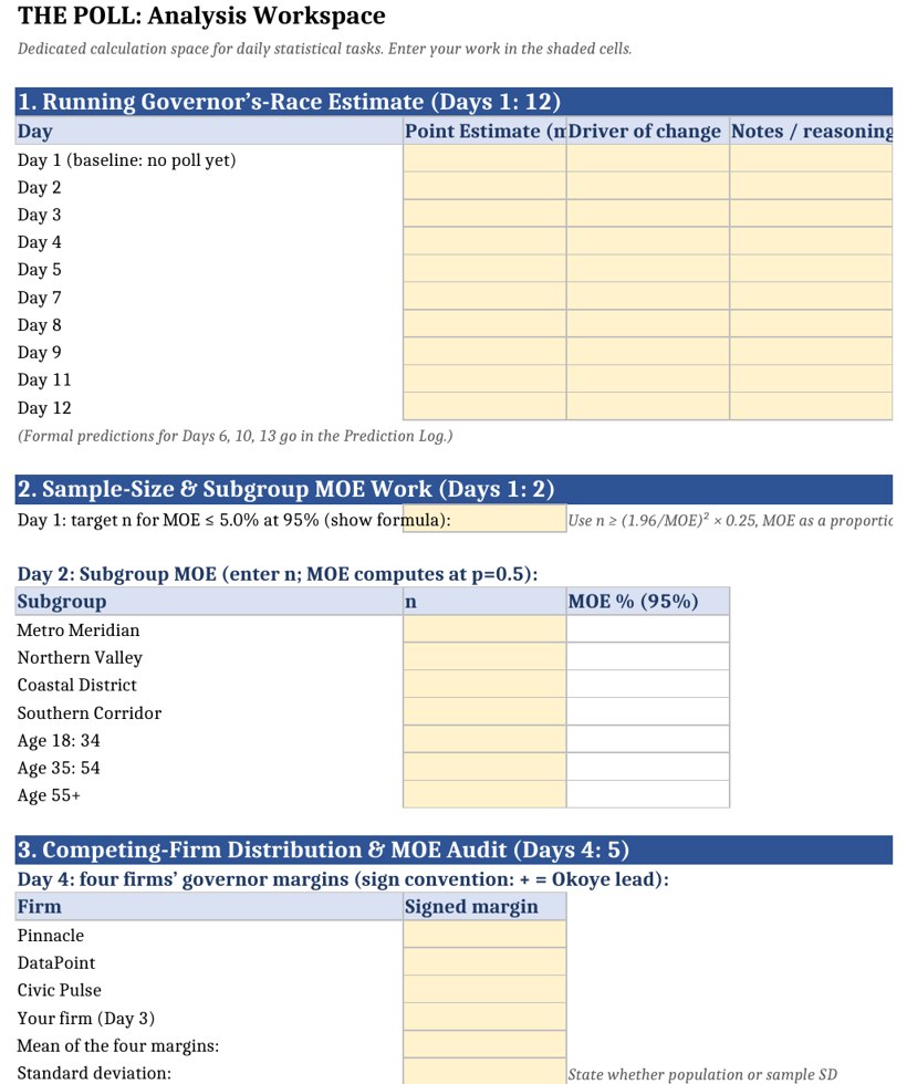
Let the workbook hold the busywork.
The Excel-based Polling Data Tracker carries the arithmetic so your students spend their energy on judgment. It logs each tracking poll, computes the margin of error from the sample size, stores the historical base rates, and holds the precinct demographics students need for the Senate District 14 regression. It has a place to log which bias they spotted that day and a field to submit the final prediction for each race. The mechanical work that usually eats a statistics period, recomputing intervals, re-entering survey numbers, redrawing charts, is handled. What remains is the part that matters: deciding whether the new number changes the call, and defending that decision against a client and a classroom full of rival firms.
Tap to see the polling data tracker
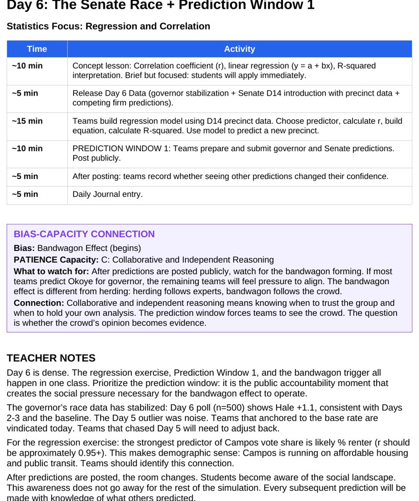
Every day is already scripted. You bring the facilitation.
The Teacher Daily Playbooks script all fourteen sessions. Each day carries a DIIE footer, Diagnosis, Intervention, Implementation, and Evaluation, so you know what to watch for, when to step in, and how to check that it landed. Connection notes pair each day's planted trigger with the bias it provokes and the capacity that defeats it, so you can name the move the moment a team falls for it. The guide tells you what the Day 7 scandal is engineered to do and which teams will overreact. A Legacy and Consequence Report links every student decision to its statistical outcome for the debrief. Prep is light. You facilitate the conversation, the simulation supplies the world, the data, and the timing.
Tap to read the teacher guide
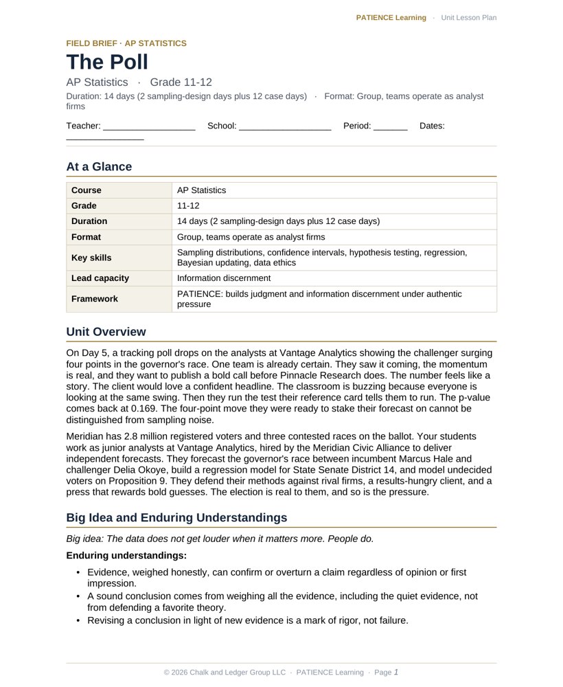
The lesson plan is already written.
Every simulation comes with a fully editable, admin-ready lesson plan. Standards alignment, daily pacing, learning objectives, differentiation, and an assessment plan are already done, so you can hand it to an administrator or adapt it to your district template in minutes.
Tap to preview the lesson plan
Close
Close
Close
Close
The day the exciting poll turns out to be noise.
On Day 5, a tracking poll drops on the analysts at Vantage Analytics showing the challenger surging four points in the governor's race. One team is already certain. They saw it coming, the momentum is real, and they want to publish a bold call before Pinnacle Research does. The number feels like a story. The client would love a confident headline. The classroom is buzzing because everyone is looking at the same swing. Then they run the test their reference card tells them to run. The p-value comes back at 0.169. The four-point move they were ready to stake their forecast on cannot be distinguished from sampling noise.
Now the choice is real. They can protect the exciting theory and ride the momentum narrative the whole room believes, or they can trust the test and hold the null. Holding the null feels like doing nothing while everyone else does something. They hold it anyway. They keep their forecast anchored to the historical baseline and write down why. Days later, when the actual margin lands at 1.3 points, the teams that chased the swing are scrambling and the team that trusted the quiet number is closest to the truth.
Welcome to the State of Meridian.
Meridian has 2.8 million registered voters and three contested races on the ballot. Your students work as junior analysts at Vantage Analytics, hired by the Meridian Civic Alliance to deliver independent forecasts. They forecast the governor's race between incumbent Marcus Hale and challenger Delia Okoye, build a regression model for State Senate District 14, and model undecided voters on Proposition 9. They defend their methods against rival firms, a results-hungry client, and a press that rewards bold guesses. The election is real to them, and so is the pressure.
| Grade level | 11-12 |
| Course | AP Statistics |
| Duration | 14 days (2 sampling-design days plus 12 case days) |
| Format | Group, teams operate as analyst firms |
| Key skills | Sampling distributions, confidence intervals, hypothesis testing, regression, Bayesian updating, data ethics |
Engineering better thinkers.
Election data is noisy, social pressure is high, and the exciting read is usually wrong. Each day plants a trigger that tempts a specific error, then arms students with the capacity that defeats it. They do not memorize bias names. They feel the sting of a compromised model, then build the discipline to avoid it.
| Bias targeted | The remedy, built into the work |
|---|---|
| Base rate neglect | Information discernmentExciting tracking polls on Days 5 and 7 tempt teams to abandon the Day 1 historical baseline. Students learn to weight the incumbency advantage and let the base rate anchor a forecast that strays toward the 1.3-point reality. |
| Representativeness heuristic | MetacognitionSmall samples of n=150 or n=200 look like the population and feel definitive. Students learn to read the margin of error first and recognize a statistical tie for what it is rather than overreading noise. |
| Herding | Adaptive strategyPinnacle Research publishes a number that contradicts the team's own data. Students learn to defend their methodology rather than mirror a prestigious firm, keeping their analysis a source of truth instead of an echo. |
| Bandwagon effect | Independent and collaborative reasoningPrediction windows let teams see each other's work and feel pressure to match the classroom consensus. Students learn to reason from the electorate, not from the room, preserving the methodological diversity that catches error. |
| Outcome bias | Productive failure recoveryMedia rankings praise the bold but weak DataPoint Group on Day 11. Students learn that being right for the wrong reason is still wrong, and that DataPoint's reckless method earns a 5.0-point average error by Day 14. |
| Framing effect | Emotional regulationOn Day 9 the client requests suggested wording changes. Students learn to hold the line under pressure, since leading questions can manufacture a result while baking in 4.2 points of systematic bias and destroying the firm's credibility. |
14 days of real election data.
The first two days build the sampling foundation: designing a plan for 2.8 million voters and reading the first n=200 sample. From there the calendar mirrors a real election cycle, moving through intervals, hypothesis tests, regression, a Bayesian scandal, ethics under client pressure, and a final synthesis where every team makes its call and meets the actual result.
| Day | What lands | Statistical focus |
|---|---|---|
| 1-2 | Designing a sampling plan for 2.8M voters and analyzing the first n=200 sample | Sampling and the Central Limit Theorem |
| 3-4 | Building 95% confidence intervals and locating internal data among rival firms | Confidence intervals and z-scores |
| 5 | A four-point swing arrives with a p-value of 0.169 and the room wants to publish (critical pivot) | Hypothesis testing and p-values |
| 6 | Using precinct demographics like percent renter to predict Senate District 14 support | Simple linear regression |
| 7-8 | An October Surprise scandal forces teams to update priors and manage Type I and Type II error (critical pivot) | Conditional probability and Bayesian logic |
| 9-10 | The client requests leading question wording and teams compute joint odds across races | Experimental design and joint probability |
| 11-12 | A methodology audit flags biased wording at 4.2 points and teams build honest versus misleading charts | Significance and data visualization |
| 13-14 | Teams make the Final Call and debrief their reasoning against the actual election results | Model synthesis and reflection |
Standards alignment.
The simulation maps to the AP Statistics Course and Exam Description and to CCSS Mathematics for high school statistics and probability. Sampling design and the Central Limit Theorem build on CCSS.MATH.CONTENT.HSS.IC.A.1 and HSS.IC.B.4, where students draw inferences from a random sample and estimate a population mean or proportion with a margin of error. Confidence intervals and hypothesis testing align with HSS.IC.B.4 and HSS.IC.B.5, evaluating reports based on data and comparing treatments. Conditional probability and Bayesian updating align with HSS.CP.A and HSS.CP.B. Regression on precinct demographics supports HSS.ID.B.6 and HSS.ID.C.8. The AP units covered span sampling distributions, inference for proportions, and inference for slopes.
The hidden architecture.
The simulation is engineered to lure students into error before it names the error. Day 5 plants a four-point swing with a p-value of 0.169, designed to look like momentum and feel like a story, so teams that trust their gut publish a bold call and teams that run the test hold the null. Day 7 stages the scandal as a Bayesian updating problem disguised as breaking news, rewarding teams that update modestly and punishing teams that overreact. The Day 9 client request and the Day 12 chart choice quantify the cost of compromise as 4.2 points of bias. The whole arc resolves on Day 14, when the bold DataPoint Group's media-darling forecast posts a 5.0-point error and the disciplined Methodologist lands within 0.97 points. The boring choice wins, on the scoreboard, in front of everyone.
Turnkey, classroom-ready.
- An admin-ready lesson plan. A fully editable plan with standards alignment, daily pacing, differentiation, and assessment, ready to adapt to your district template. Included with every purchase.
- 14-day teacher playbooks. Daily guides with DIIE footers and bias-capacity connection notes so you know what to watch for and when to step in.
- An Excel-based student workbook. The Polling Data Tracker computes margins of error, logs polls and biases, and submits each final prediction.
- A student briefing packet. World-building documents, candidate profiles, and role definitions that make the Meridian election feel real on Day 1.
- Statistics reference cards. Quick-access sheets for sampling methods, probability formulas, and hypothesis testing rules.
- A dual rubric system. The 36-point rubric grades the quality of reasoning across a daily journal and a final reflection, not whether the prediction was right.
- A Legacy and Consequence Report. A teacher roadmap linking every student decision to its narrative and statistical outcome for the debrief.
Give your students an election worth getting right.
Bring The Poll to your AP Statistics classroom and let your students feel why disciplined methodology beats a bold guess, before the exam ever asks.
Get this simulationPreview real pages from the simulation before you spend a dollar. No guessing, no surprises.